The Choice Of Colour
Statement of intent
I have chosen to study colour photography as colour to me is one of the most important part of photography - a shot could be perfectly framed using positional techniques, such as the rule of thirds ect, but if the composition of your colour is not balanced, it wont display the atmosphere the photographer intended.
Colour is often a tool utilized in marketing, specifically to make a product for a company look more desirable and help it sell, as colour resonates with people on an emotional level in a way that words and other things simply cannot. For example, red is an extremely vibrant and standout colour, often being associated with anger and fire or warmth, and is quite eye-catching while among other colours whereas green has connotations of health and is quite a soothing colour, purposefully being used by grocers when selling fruit and vegetables to create the idea that it is quite fresh.
A demonstration of the power colour holds is that, when selling fresh produce, browns are typically avoided as it connotes to rotting and overripe vegetables, which would put consumers off. I hope to also use colour in this way and perhaps have a shoot where I also use it to produce a set of advertisement-type photos with products of my choosing.
Photographers I will study and research in order to gain some insight into colour photography may be Alec Soth, William Eggleston and others. One photographer that has already caught my eye already is Nicholas Godden, his website displays a range of styles such as black and white with hints of colour. He has used street graffiti where he has selected images that highlight colour. I would like to capture street graffiti as I think it would be a good starting point for my project and it will also make me have to go on location outside of school which I feel could help with the images I capture for this project. He has also used a slow shutter speed to capture coloured lights. I like this idea of using a slow shutter speed to capture the movement of coloured light however I may not have enough time to try this technique out.
Initially I wanted to study the Choice of Colour in order to be able to both work on this project while in school and in my free time, as I didn't wish to limit the amount of work I can put in to it. To conclude this project, I am aiming to have a final gallery of my best photos and display my refined work then my final outcome may be appear as an advert, due to the pivotal role colour plays in influencing consumers. I also aim to develop my camera skills even further that I did in my last project, with my goal as being able to co-ordinate and carry out a shoot independently without the help of others.
I have two themes that I'll like to do one of them is black and white images that has a bit of colour on it so that bit of colour stands out more and makes your eye be drawn to it .The next kind of image I'll like to do is a plain style type of image that the objects does blend in with the back ground so the object look nearly camouflaged into the background but one part of the object stands so you can see the object like it is a illusion. I will also try to create images that have a contrasting background colour and possibly use this as an advert.
I will continue to look at photographer through out the project to gain ideas and inspiration from. I will also ask my peers for suggestions and ways to improve the images I take as I feel other peoples input will help me to gain a better finish.
Mind map

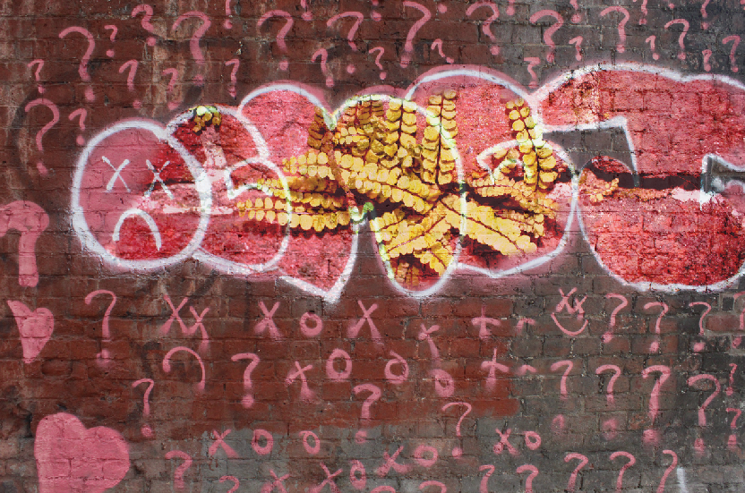
Mood board graffiti


I like the graffiti images because I like how colour stands out and how the whole image is black and white but I like how they use vibrant colors to out shine the the black and white.

Context
Quoted from nico goodden blog page "about me"
My name's Nico and I’m passionate about creativity, more specifically here: Photography.
For over a decade I have been a professional London urban photographer, street photographer, writer / content creator and photography tutor.
My photography itself has in recent years shifted towards plants and fungi photography, I feel using photography to raise awareness is of a greater purpose.
Through my blog I help others improve their own photography and I am currently in the final stages of a commissioned photography learning book.
This blog currently ranks fourth among all UK Photography Blogs based on visitor numbers, frequency and quality of new articles, social media engagement and website authority.
The articles I write and the photography I produce are often featured by leading international publications including Time Out, The Guardian, Evening Standard, The Huffington Post, Creative Review, Digital Camera Mag, FStoppers, PetaPixel, Digital Rev and many more.
My urban / street photography has been exhibited both in London with Proud Galleries, Hoxton Hotels and Drakes & Morgan Bars but also abroad at the W Hotel in Barcelona. Soon enough my nature photography will follow suit.
Many global brands come to me (including Adidas, Peugeot, FTSE100 companies…) for photography, cinemagraphs, timelapse and other visual assets.
I also help individuals leave a stronger mark either personally or professionally with the help of my photography and marketing knowledge.
Composition
Nico Goodden says that he uses a tripod to get a perfect eye view, I feel the orange paint makes your eye be drawn to it because the rest of the image is in black and white .Having colour in it makes me think that the views will wonder if the image is actually an original black and white and it has been manipulated on Photoshop but at first glance it looks like it has not been changed and that's how it looks until you notice the colour of the grass.
The white balance I think is probably set to either auto or sun light and the ISO is probably on auto as the image looks like it was taken in the middle of the day but to me its really hard to tell what time of day it has been taken as the image is black and white.
The Photoshop technique he has used is changing the image to black and white but the writing and the paint can was changed to a different colour or he has added the colour using the painting tools.
This wasn't a studio shoot as it looks like it was taken in a public place because there is a pipe in the picture this could represents that its on a alleyway wall and there is grass in the foreground which indicates outside location.
The image has been captured on a fairly plain background with the left hand side being mostly black as it is a stencil of figure the figure is holding a paint brush which draws your eye to the orange colour paint. I like how the positioning of the writing is in line with the figures mouth which to me looks as though he is saying the words. The writing stands outs as it is orange and has been placed right in the middle of the image.,
Connections
I would use his work as a starting point as this inspiration of colour is a technique I could use on Photoshop. I would like to do work similar to him because when I first saw his images I felt like I would be able to uses the black and white style .
I also like the graffiti style he used as I feel it expressed the feelings of people and by highlighting the words in colour it gave the image more meaning.
I also like the graffiti style he used as I feel it expressed the feelings of people and by highlighting the words in colour it gave the image more meaning.
comment
I like how he uses the black and white feature to express the colours of the writing and how to me it shows the true meaning of something as it stands out when it is placed in your eye line. The image represent something that was happening in that era.
Shoot plan
I am starting this project by taking inspiration from Nico Goodden he shows me how black and white images have a meaning and this attracts people when he makes a black and white image and then adds a bit of color to it so the colour stands out even more. I'm going to try to take images like his and edit them so I can make one part of the image stand out.
I would like to take these images in the center of Manchester because I think the center of Manchester has the best urban feel to it because I'm going to mostly do out door shoots I think would have put the WB and IOS on auto
I would like to take these images in the center of Manchester because I think the center of Manchester has the best urban feel to it because I'm going to mostly do out door shoots I think would have put the WB and IOS on auto


Best
This is my best image because it isn't blurry and also you can see the image easily and it is more clear also the ISO is perfect so is the WB.
|
worst
This is my worst image because the image is blurry and also the WBL and exposure isn't right for this image because of this it made the image look white.
|


Best
This is my best image because in this image you can see the detailed of the graffiti and the vibrant colors makes your eye drawn to the them like them oranges as glasses makes your eye drawn to it.
|
Worst
This is my worst image because I was to close to the wall so the image is blurry and I could not focus the camera properly.
|
Street art


Graffiti


Best
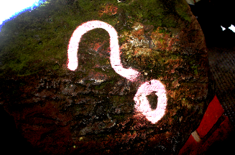
This is my best image because as you can see your eye is drawn to the question mark because it is pink and the back ground of it is brown and green moss on it this image makes you think is there a story behind this question mark.
|
Worst
This is my worst image because the image is cut off and some bits of it you can see that it is blurry especially in the left hand corner.
|
Question mark?


|
|
I did this photo shop because I wanted to see what I can do with double exposer and mess around with it I wanted to go with a theme like something ominous so when I was doing it I stumbled across a good idea to see what it would look like to change the flower color so it looks like there is more green moss the first edit makes the viewer look at the green bit along with the question mark the second image makes the viewer ask is his in a horror movie the viewers eye would be drawn to the question mark and then to the wall fall of moss.


For this photoshop I did double exposer so the graffiti and the leaf's combine together to make it look like the graffiti was originally spray painted with the leaf's on it and also make the writing stand out because of its different color
pencils


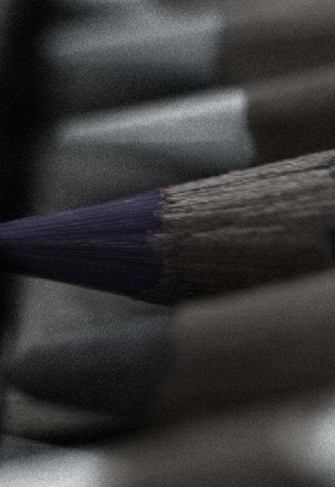
Best
This is my best image because it looks clear.
you can see the little specs of the pencil your eye is drawn to the middle pencil because the other ones are blurred so it would make your eye drawn to it the lighting makes it look like a sun rise and its rising on a sand dessert |
Worst
This is my worst because there is no main focus of this image also and it is very blurry making it un appealing
|
Snips


Final
Paint pallet


oil paint


Snips


Final

Mood Board Art Design


I am doing art posters because I like the way they show you how cool the club is and how you can be free with the photoshop edits also I like how it can give me professional skills to know how to make these posters
Inspiration from Jacob Reishel
Mood board Jacob Reischel


I chose Jacob Reichel work because I like the way he picks his color and uses it like the first photo the red wire is almost hidden and the shoe stands out because of the white bit inside of it but on the second image he takes a different approach by melting the ice pop making the liquid blend with the back grounds and also the uses of a red ice pop makes your eye drawn to it with the last image the perfume bottles are blending to the red back ground but certain parts doesn't blend but the shadow adds a little bit of contrast.
For this shoot I will use the inspiration from JACOB REISCHEL
Sweets


Best
This is my best image because you can see the glosses of this sweet and how the sweet is reflecting so your eye is drawn to the light bit
|
Worst
This is my worst because the image is to blurry and it isn't appealing to the eye and my iso is not set to the right setting
|
Light box


Best
This is my best image because you can Cleary see the image and it perfectly matches my mood board.
your eye is drawn to the sharpener that you can see the blade on because it isn't yellow but is surrounded by yellow |
Worst
This is my worst image because it is to dark so the image does look that well and also I am zoomed in way to much
|
Mock Edit

Snips


Final

This image was good to edit because it had a plain back ground which made it easier for me to fix all the cracks in the wall. The blue shutter makes your eye drawn to it and made the the image stand out, I would have liked it better if there was more graffiti on the image that I took.
Original


